Two decades ago, you could get away with using a cheap online website builder to throw some block text, a few grainy pictures, and a basic contact form onto a page.
But today, typical agency-designed websites are a massive liability. They are stuffed with heavy, auto-playing video loops, multi-image carousels, and generic stock photos of smiling actors holding pristine clipboards. While these “arty” sites might win design awards, they leak high-ticket leads like a rusted pipe. They fail the ultimate test: loading instantly on a mobile phone and converting cold, stressed property owners into immediate phone calls.
In 2026, construction and contractor web design is no longer about aesthetics. It is about site speed, mobile-first conversion, and semantic extractability for AI search engines.
This article lays out the exact blueprint to transform your construction company website from a passive digital brochure into a high-performance sales machine — covering contractor website design, contractor website CRO, and every element of a mobile-first contractor website built to dominate local search in 2026.
What website design elements are a must-have for construction websites?
To dominate your local territory, your construction website must be structured like a high-velocity sales funnel. If a visitor cannot find your phone number and verify your credibility within 3 seconds of landing on your page, they will bounce back to the search results.
Here are the non-negotiable architectural elements of a high-converting contractor website:
1. Navigation bar
Most agency-designed navigation bars are chaotic junk-drawers that overwhelm visitors and dilute your link equity. A high-performance navigation bar must be clean, highly focused, and locked as a sticky header at the top of the viewport at all times.
Instead of linking to thin, irrelevant blog posts, your navigation must guide users directly to your core service silos and high-trust conversion assets (like reviews, galleries, and booking tools). For mobile users—who make up over 80%of your high-intent traffic—the navigation bar must prioritize a prominent, high-contrast click-to-call CTA.
2. Large header photos
The “arty” corporate trend of rotating sliders and auto-playing background videos is a conversion killer. Carousels bloat your Largest Contentful Paint ($LCP$) metrics, while video loops distract the user’s eye from your primary call-to-action.
- The Single-Hero Rule: Replace rotating carousels with a single, high-impact, professionally shot image of your actual crew, wrapped service trucks, or a marquee local project.
- The Speed Parameter: Compress this hero image to under 100KB and deliver it early in the server-rendered HTML using
fetchpriority="high". Your absolute target must be $LCP le 1.5 seconds.
3. Social media icons / links
Standard agencies make the catastrophic mistake of placing social media icons in the header of a website. This serves as an immediate traffic leak, sending hot prospects away from your high-converting page and into the distraction-filled ecosystems of Facebook or Instagram.
At Demand & Convert, we banish social media links to the footer of the page. We replace that prime header real estate with localized trust stacks: Google review badges, licensing credentials, and manufacturer certifications (such as GAF, TrexPro, IICRC, or Owens Corning) that immediately validate your authority.
4. Professional work images
Stock photos of actors wearing pristine hardhats destroy consumer trust instantly. Homeowners and commercial facility managers are deeply skeptical; they want to see real-world proof of your workmanship.
- Geo-Spatial Visual Proof: Your gallery must feature crisp, high-resolution, compressed images of your actual field crews executing projects.
- Contextual Validation: Pair your project photos with the specific suburb, estimated customer savings, and a link to the real-time review associated with that exact job.
5. Mobile-friendly web design
Because more than $80%+$ of local trade and emergency searches occur on mobile devices, your layout cannot simply be “responsive”—it must be designed specifically for one-handed, thumb-driven navigation.
Every critical conversion element—your phone number, your trust badges, and your primary contact button—must be immediately accessible within the natural sweep of a user’s thumb.
What pages should your construction website have?
A high-performance contractor website does not need dozens of pages of content fluff. It needs a hyper-focused set of high-intent structural pages:
1. Portfolio / Project Gallery
Your gallery is not a passive photo album; it is a geo-spatial proof engine. Every project listed must include:
- The specific local neighborhood or suburb where the work was completed.
- A brief, technical rundown of the materials used, structural challenges solved, and regional code compliance criteria met (e.g., local frost line depths for deck footings).
- High-contrast, before-and-after visual sliders that show the exact transformation.
2. Reviews / Testimonials
Homeowners trust third-party reviews far more than your own marketing copy. Instead of copy-pasting unverified text quotes, you must integrate live Google Reviews directly onto this page using schema markup. This allows search engines and AI models to parse the reviews as verified entities, directly feeding your local map-pack rankings.
3. Services
To capture high-stress search terms, you must split your offerings into Transactional Service Silos (e.g., creating separate, dedicated pages for Emergency Roof Repair, Asphalt Shingle Replacement, and Flat Roof Waterproofing).
Lumping all of your services onto a single, generic page confuses search engine crawlers, dilutes your semantic authority, and makes it impossible for AI Overviews to crawl and cite you.
4. About Us / Company
The primary objective of your “About” page is to prove to Google’s vector search engines that you are a verified, legitimate local business. This page must explicitly list your physical coordinates, local licensing details, commercial liability insurance limits, and active manufacturer certifications.
5. Contact
Your booking page must be built for maximum velocity. Keep your intake forms restricted to a maximum of $3$ fields (Name, Phone, and Zip Code/Service Need). Every additional field you add beyond this threshold drops your overall conversion rate by approximately $10%$.
Construction website designs updated for 2026
To understand how high-performance design drives revenue, let’s analyze some of the best construction websites 2026 has to offer — real-world construction website examples that show how local contractor sites balance CRO, speed, and local entity authority.
Tidal Construction Group
- The Conversion Highlights: Tidal’s layout communicates immediate professionalism through high-contrast project visuals. Their service options are clearly segmented, and they maintain a dedicated subcontractor interface that streamlines communication.
- The Performance Gap: While visually appealing, the site relies on client-rendered elements that can delay initial load times on mobile devices. For trade traffic, switching to pre-rendered HTML blocks would significantly improve their Core Web Vitals.
M Scott Construction
- The Conversion Highlights: This site excels at targeting B2B and commercial sectors (such as schools, assisted living, and retail). Their portfolio features technical project descriptions and municipal building code compliance details that establish immediate authority.
- The Performance Gap: The home page lacks a persistent, sticky tap-to-call button. Commercial property managers operating under tight deadlines require immediate, friction-free methods to reach an estimator.
Eberson Construction and Remodeling
- The Conversion Highlights: Eberson leverages a clean, straightforward layout that focuses on high-ticket residential renovations (additions, custom builds). Their project gallery provides concrete proof of workmanship.
- The Performance Gap: The site’s heading hierarchy skips crucial structural levels. Correcting this to follow a strict $H_2 to H_3$ nesting pattern would instantly improve their search extractability for local search engines.
Keith Guyer Building & Remodeling
- The Conversion Highlights: This site successfully communicates local proximity by referencing specific target service suburbs (Greenfield, Amherst, Northampton).
- The Performance Gap: The layout is overly simplistic and misses major trust stack integrations. Proving their certifications and embedding their live Google Reviews directly above the fold would double their conversion rates.
ASI General Contractors
- The Conversion Highlights: ASI establishes immediate B2B authority by highlighting their commercial sectors (banking, healthcare, federal) alongside their historic longevity (since 1976) and WBENC certification.
- The Performance Gap: The layout avoids distracting design trends but lacks direct-response lead capture funnels. Adding a low-friction “Request a Site Walk” form on service pages would increase their digital lead volume.
Yerba Buena Engineering & Construction
- The Conversion Highlights: Designed for public works and heavy civil infrastructure projects. It highlights active local community development and places a heavy emphasis on structural safety and environmental compliance.
- The Performance Gap: The copy is structurally dense, making it difficult for machine-reading systems to scan. Formatting their service descriptions into clean bullet lists and answer-first FAQ blocks would boost their AI engine visibility.
Peepels Mechanical Corp.
- The Conversion Highlights: Peepels establishes immediate historical trust, prominently displaying “Your Trusted Mechanical Contractor Since 1928” near the top of the viewport.
- The Performance Gap: The site relies on heavy, uncompressed project images. Compressing their portfolio images to under 100KB would instantly lower their mobile page load speeds.
Mehrer Drywall
- The Conversion Highlights: Mehrer balances strong structural visuals with informative, technical content regarding their specialized design-assist and metal stud systems.
- The Performance Gap: The site embeds interactive video loops that degrade their mobile Largest Contentful Paint (LCP). Deferring these heavy assets below the fold would optimize their mobile performance.
A quick look at the top 18 construction website designs
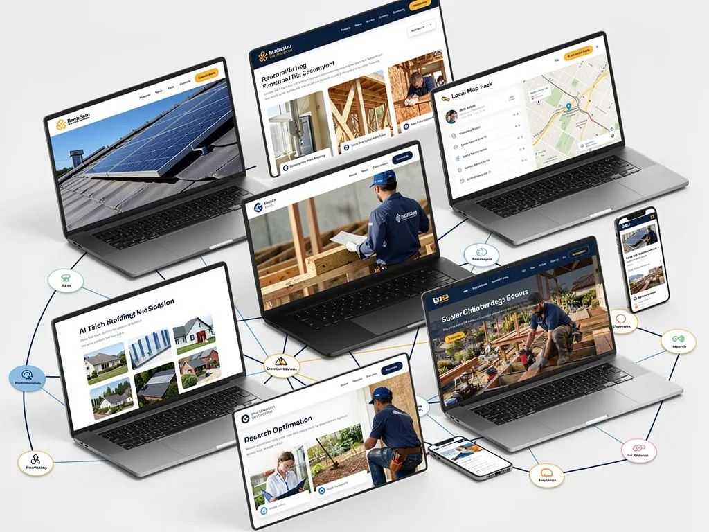
Many web design agencies point to massive corporate construction sites as benchmarks. Let’s analyze why these enterprise models fail local CRO, and look at the real-world elements that drive contractor leads in 2026.
Kiewit Corporation & Bechtel
- The Corporate Bloat: These enterprise giants use huge, rotating background sliders and vague marketing copy like “Extraordinary Projects, Exceptional Performance.” This works for securing multi-billion-dollar government infrastructure tenders, but it is fatal for residential and commercial service contractors.
- The Conversion Leak: There is no clear, above-the-fold call to action, the load speeds are degraded by massive asset libraries, and the navigation requires multiple clicks to find basic service directories.
Skanska & Fluor
- The Navigational Maze: These sites are built for corporate PR rather than lead generation. They focus heavily on hiring pipelines, sustainability reports, and investor relations.
- The Local Failure: There are zero localized trust stacks or geographic signals. If a regional commercial developer lands on these pages looking for immediate assistance, they are buried under corporate messaging.
Re-Bath & Reborn (High-Performance Models)
- What They Do Right: These brands understand the math of home improvement. The first thing you see is a clear value proposition, highly visible trust badges, and direct links to book design consultations.
- The Trust Stack: They leverage real customer review ratings from platforms like Google, Houzz, and HomeAdvisor alongside real-world video testimonials featuring actual homeowners showing off their completed projects.
ABC Seamless & Dreammaker
- Interactive Engagement: ABC Seamless utilizes a custom, interactive design visualizer tool. This allows homeowners to design their own exteriors, increasing on-page dwell times (a massive ranking signal) and pre-qualifying the customer before they ever speak to a salesperson.
- Clear Value Props: Both sites outline their core guarantees and manufacturing certifications right underneath the hero image, addressing buyer skepticism upfront.
Connect Homes
- The Aesthetic Exception: Connect Homes uses a minimalist, clean aesthetic that mimics luxury architectural magazines.
- The Conversion Trap: While beautiful, the site lacks traditional high-contrast CTA buttons. Stressed or busy buyers will not hunt through a minimal layout to find your phone number.
Tutor Perini & PCL
- The Authority Model: These heavy-highway and civil giants prove their massive capabilities by displaying concrete project costs, timelines, and technical structural data.
- The AI Opportunity: To dominate modern search, these project directories must be structured with strict schema markup so AI search crawlers can parse and cite their engineering achievements.
Restore Tactics & Jova Construction
- Strategic Direct Response: Restore Tactics implements a high-converting, localized intake form directly above the fold, instantly capturing intent.
- Brand Cohesion: Jova Construction maintains flawless brand consistency across their site, emphasizing their PMP-certified managers and structured client communication systems to ease customer anxiety.
Webcor & McCarthy
- Granular Sitemaps: These commercial giants organize their massive project histories into granular, easily filterable categories (Aviation, Education, Healthcare).
- Structured Navigation: By keeping their navigation paths clean, they ensure both human visitors and machine-reading crawlers can access deep content nodes in two clicks or fewer.
Construction website design key takeaways
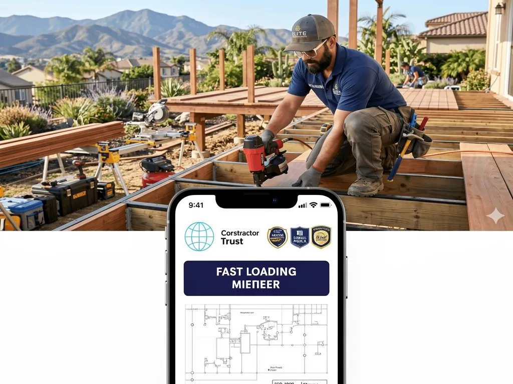
To build an SEO and CRO machine that dominates your local territory, apply these four core rules:
1. Keep it simple
A plain, black-and-white website that loads in 0.5 seconds will always out-convert a beautiful, modern website with heavy animations that takes 4 seconds to load. Keep your layouts clean, your code lightweight, and compress every single project image to under 100KB. Leverage whitespace to guide the user’s eye directly toward your primary phone number and contact forms.
2. Think about your visitors
Your prospective clients are not visiting your site to admire your design aesthetics. They are looking for immediate answers to high-stress problems or trying to calculate the upfront cost of a major investment. Restructure your copy to address their anxieties directly:
- Do you handle the city permits and HOA approvals?
- Are your field technicians background-checked and licensed?
- Do you offer upfront, flat-rate pricing and warranties?
3. Make your website fast and responsive
Google predominantly indexes your site based on its mobile performance. Run a technical speed audit to ensure your mobile LCP is under 1.5 seconds. Eliminate third-party tracking scripts, avoid lazy-loading above-the-fold images, and use clean, server-rendered HTML blocks rather than bloated client-side JavaScript frameworks that search engine crawlers struggle to parse.
4. Make your calls-to-actions stand out
Do not make users search for your contact information. Place your click-to-call phone number in bold, high-contrast accent colors within your sticky header, and place a simple, thumb-friendly CTA button (e.g., “Request a 3D Design” or “Book Free Inspection”) after every major content section on your page.
Stand out from your competition with a professional construction website design
Stop losing high-ticket installation leads to slow, bloated, outdated websites.
At Demand & Convert, we specialize in designing and engineering lightning-fast, high-converting digital assets specifically built for contractors and construction companies. We build hard-working, lead-generating systems that establish your brand as a verified local authority in Google’s map packs and AI search engines.
**Get in touch with our team today to build your custom high-performance website.**
Subject Matter Context
Core Pillar Connection: This technical guide is part of our High Performance Contractor Web Architecture series. For comprehensive execution and guaranteed results in your local area, review our official protocol: High-Performance Mobile-dominant Contractor Conversion Engines .

 27 Best Home Builder Website Designs in 2026