

Plumbers, electricians, roofers, and solar installers depend on mobile websites to reach homeowners and win high‑value jobs. A fast, simple, and informative mobile site turns casual visitors into calls and booked projects. This guide explains what homeowners expect from contractor mobile sites and how to design yours to meet those expectations.
Getting mobile design right is essential if you want to capture and keep customers in a crowded marketplace. With mobile now outpacing desktop, optimizing your web design strategies for phones isn’t optional — it’s how you protect leads and your reputation. Below we’ll walk through speed, layout, content, and CTAs with practical, contractor-focused tips you can use today.
Why Your Mobile Website Is Your First Sales Pitch to Homeowners
For many homeowners, your mobile site is their first real contact with your business. It needs to communicate credibility fast and make it easy for them to act. Prioritizing mobile means you stay competitive and improve your odds of winning bigger jobs.
Mobile Traffic Has Already Passed Desktop
More than half of web traffic now comes from phones, so homeowners are searching for contractors on mobile more than ever. That makes a smooth mobile experience essential for busy homeowners who want quick answers and reliable pros.
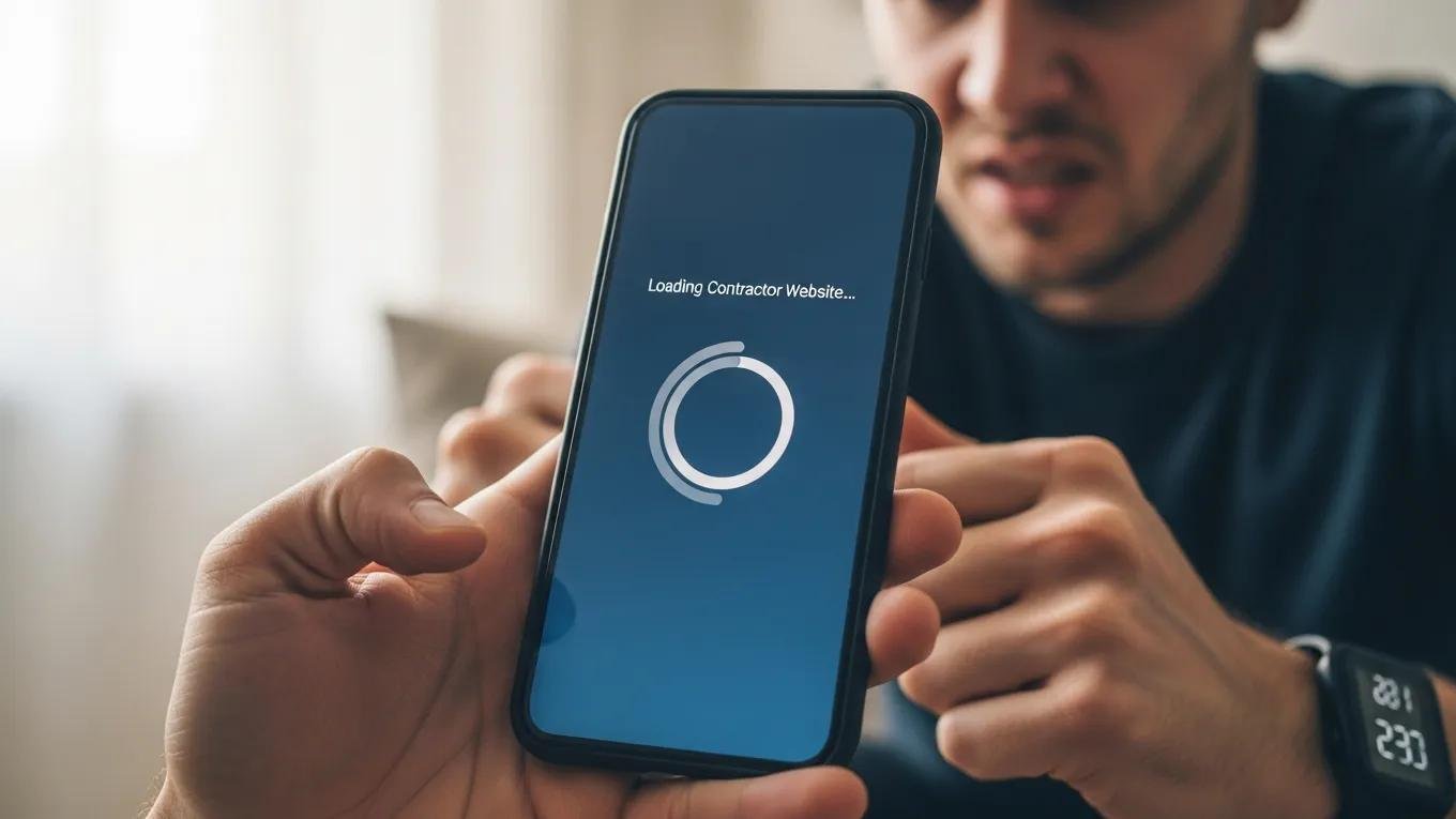
What a Poor Mobile Experience Is Actually Costing You
Homeowners expect fast, usable sites. If your pages drag past three seconds, 53% of visitors will bail — and you could lose as much as 20% of potential leads. For contractors, slow sites mean missed estimates and missed revenue.
Speed is often the deciding factor between a lead and a lost opportunity.
Optimizing Web Performance for Mobile User Experience
In today’s digital environment, users expect instant, smooth web experiences. A recent study[1] found that 52% of users will abandon a site that takes more than three seconds to load. That makes measuring and improving load times and responsiveness essential for businesses looking to convert visitors into customers.
Web performance tooling and the importance of web vitals, MK Dobbala, 2022
Speed — The First Thing Every Homeowner Judges on Mobile
Homeowners expect contractor sites to open quickly on their phones. Even small delays create frustration and drive them to the next contractor in search results. Optimizing load times keeps prospects engaged and boosts the chance they’ll book your services.
How Slow Is Too Slow on Mobile
Aim for page loads under three seconds to meet homeowner expectations. Regular speed audits and fixes like image compression, caching, and reducing third‑party scripts will help you keep load times low.
How Page Speed Affects Your Mobile SEO Rankings
Google’s Core Web Vitals factor page speed into rankings. A faster mobile site improves visibility when homeowners search for local contractors, which means more organic traffic and more inbound leads.
The Layout and Navigation Homeowners Expect on Mobile

Homeowners want sites that make answers obvious and fast to find. A clear layout and intuitive navigation reduce friction and increase the chance they’ll call or request a quote.
Thumb-Friendly Design: Buttons, Links, and Tap Targets
Design for thumbs: big, well‑spaced buttons and tappable links prevent accidental clicks. A thumb‑friendly layout improves usability for homeowners browsing on the move.
Mobile Menus That Guide Rather Than Confuse
Keep menus simple and logical so homeowners can find services, contact details, and reviews without digging. Clear categories and a sensible hierarchy speed up decision making.
White Space and Visual Hierarchy on Small Screens
Use white space and strong visual hierarchy to highlight services, pricing cues, and contact options so visitors can scan and act without feeling overwhelmed.
The Content Homeowners Are Actually Looking For
Homeowners want direct, useful content that answers their questions and builds confidence. Tailor copy to what they care about and you’ll see higher engagement and more calls.
Contact Information in Plain Sight
Show your phone number, email, and address clearly on every page. Easy access to contact info builds trust and makes it simple for homeowners to reach out.
Click-to-Call Buttons and Tap-to-Navigate Directions
Add click‑to‑call buttons and one‑tap directions so homeowners can contact you or find your shop in a single tap — convenience that converts.
Reviews and Trust Signals That Reduce Hesitation
Feature customer reviews and trust badges prominently. Positive testimonials, certifications, and local affiliations reassure visitors and increase bookings.
Scannable Service Descriptions and Pricing Signals
Use short, scannable service descriptions and transparent pricing cues. Homeowners skim — clear, concise information helps them decide faster.
CTAs That Drive Action on a Small Screen
Strong calls to action guide homeowners toward booking you. On mobile, CTAs must be obvious, frictionless, and easy to tap.
One Primary CTA Above the Fold
Feature a single primary CTA like “Request a Quote” or “Call Now” above the fold so visitors see it right away and can act immediately.
Sticky Buttons and Persistent Contact Options
Use sticky CTAs that stay visible while users scroll so homeowners can contact you without hunting for info. Persistent contact tools improve accessibility and conversions.
Mobile-Friendly Forms That Don’t Frustrate
Keep forms short and use simple inputs to cut friction. Minimal, focused forms reduce abandonment and increase the number of leads you capture.
The Technical Side of Mobile Performance for Contractors
Technical polish is what makes a fast, reliable mobile experience possible — and what turns visits into booked jobs.
Responsive Design vs. Mobile-First Design — What’s the Difference
Responsive design adapts a desktop layout for smaller screens. Mobile‑first design starts with the phone experience and builds up. For contractors, mobile‑first sites are often faster and more usable for homeowners on the go.
Designing mobile‑first gives you a practical edge that matches how homeowners actually search and interact with contractor sites today.
Mobile-First Design: Best Practices for Web Development
Adopting mobile‑first design principles is a modern best practice. Starting with the mobile experience ensures your site performs well where most users are — on their phones — and keeps you aligned with evolving user expectations.
Mobile first as a best practice in web design, 2015
Core Web Vitals and What They Mean for Your Mobile Rankings
Core Web Vitals measure loading, interactivity, and visual stability. Improving these metrics boosts mobile SEO and makes it easier for homeowners to find your services.
Image Optimization and Lazy Loading for Faster Mobile Pages
Compress images and use lazy loading to cut load times. Faster pages lower bounce rates and keep homeowners engaged long enough to request a quote.
How to Evaluate Your Current Mobile Website Experience
Regular checks will reveal the issues costing you leads. Use reliable tools to test speed, usability, and overall mobile performance.
Free Tools to Check Your Mobile Performance
Tools like Google PageSpeed Insights and Lighthouse give clear diagnostics on mobile performance and highlight what to fix first.
Where to Start When Your Mobile Site Has Multiple Issues
Prioritize fixes that most impact user experience: load speed, navigation, and prominent contact options. Tackling those first delivers quick, visible improvements in engagement and conversions.
Frequently Asked Questions
Mobile website design for contractors focuses on speed, clear layout, relevant content, and friction‑free user flows so homeowners can find and hire you quickly. Get these elements right to generate more leads and win higher‑value jobs.
To boost targeted traffic from homeowners actively searching for services, consider exploring our PPC services.
Your Mobile Website Should Work as Hard as You Do
A well-built mobile site that matches homeowners’ expectations is essential for blue‑collar contractors who want to grow. Focus on speed, simple navigation, useful content, and clear CTAs to convert visitors into high‑value clients. As mobile traffic continues to rise, investing in optimization is how you stay competitive and increase revenue.
Contractors ready to expand their reach can also use our social media services to engage homeowners and build local awareness.
If you’re selling products or booking services online, explore our ecommerce web design solutions to open new revenue streams and make transactions simple for customers.
When you consider e‑commerce, focus on the core elements that create a customer‑centric store and drive repeat business.
Key Elements for Customer-Centric E-commerce Web Design
Because e‑commerce depends on your website as the main customer touchpoint, it must fulfill buyer needs across six areas: (1) context — a clean, functional layout; (2) content — clear text, images, and media; (3) community — user interaction and social proof; (4) personalization — tailored experiences; (5) communication — easy help and feedback; (6) trade — smooth purchasing flows. These factors draw on research into online user experience and influence how visitors process information and perceive your site.
Factors influencing user experience, T Semerádová, 2020
Subject Matter Context
Core Pillar Connection: This technical guide is part of our High Performance Contractor Web Architecture series. For comprehensive execution and guaranteed results in your local area, review our official protocol: High-Performance Mobile-dominant Contractor Conversion Engines .
Related High Performance Contractor Web Architecture Resources:
- • Why Your “Contact Us” Form is Costing You $50k a Month (And How to Fix It)
- • The 2.5-Second Death Window: Why Your “Pretty” Website is Starving Your Dispatch Board
- • Build a Keyword Strategy That Helps Local Contractors Boom Now & In the Future
- • Reviews Sentiment
- • Website Essentials Every Local Contractor Needs to Win High‑Ticket Jobs
 Why Local SEO Is Crucial for Blue-Collar Contractors and How It Will Drive High-Ticket Jobs